UX Case Study: Shine bank 80% conversion onboarding
Publié le 10 février 2022
par Bruno Paccini
7 min. de lecture
Publié par Bruno Paccini
Mis à jour le 28 octobre 2024
7 min
Getting people to be interested in your product is hard so when they are taking the plunge and finally downloading your app, you don’t want to lose them.
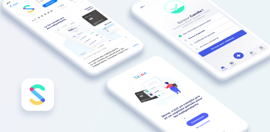
How to make sure the user is completing your entire onboarding flow?
At Shine, we’re building a professional bank account for freelancers, so as our typical user can be a 18-years-old biker or my 60-years-old dad, we have to be both modern and traditional at the same time.
Throughout this article, I will explain how we’ve built our modern and classic onboarding with a 80% conversion rate.
I/ The App Store
First things first, making the user trust you even before downloading the app is a major onboarding step.
1. The rating
The first thing the user is going to see, even before your app store preview, even before the description is the rating.
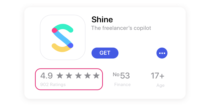
Shine on the App Store (November 24th, 2018)
You will need a good rating. Luckily for you, we have written an article about how to achieve this.
2. The preview
The second thing your user is going to see is the preview image of your application.
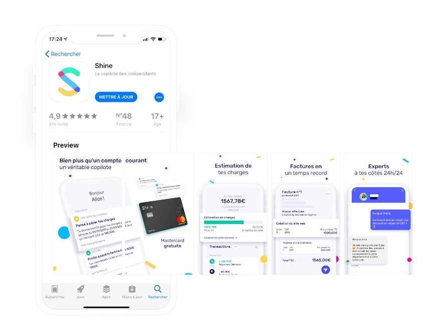
App Preview (French App Store)
There are multiple resources available online to help create attractive previews. The user should be able to understand the purpose of your app at a glance.
In our case, Shine is providing:
A bank account
A free mastercard
Tax forecasting
An invoicing tool
Financial support
II/ The App
As mentioned in a previous article:
One of Shine’s features is to provide a bank account.
We want our users to trust us more than any archaic bank.
So we need to be 10 times better than them.
How to be 10 times better?
Every little detail counts. When we designed the registration, we had to think about how we could directly enhance user experience.
Here are a few tips to maximize your conversion rate.
1. Your user should always know why
Your user should always know why he has downloaded the application.
He should always know why he is using your app even before figuring out how he is going to use it.
Once he has downloaded your app, he can open it a few seconds or days later.
When he is opening your app, you should remind him what the app is actually doing and why it’s going to help him
Shine’s Features: App Carousel
At Shine, we are using a basic carousel to present Shine features but it does the trick!
It’s a basic layout and can obviously be enhanced. If you choose a carousel layout like we did, make sure to put the most important features on the first slide, it’s probably the only one the user will look at.
2. Keep it simple: one screen, one action
Keep it simple, focus on an action, a screen should be designed to maximise the result, one action, one screen. Do not reinvent the wheel, always remember that “less is more”.
It should be clear where the user has to click to convert, in the screen above, we are using a big Get Started - Call To Action (CTA) button.

CTA Button: Get Started
Here are a few rules to follow to make your CTA convert more (e.g. UX Practices: 8 Handy Tips on CTA Button Design):
Make your CTA Button look clickable: round corner, shadow
Choose the proper size: a large button has high chances of being noticed and clicked
Apply contrasting colors
More imperative, fewer words
Smart placement can increase the chances of CTAs being noticed even more
Opening view within the app: Pricing screen
Your main focus in this screen is making your user click on the big “Get Started” button but your lead can still have some doubt, this can be about the pricing, additional features or anything else.
You should be able to answer all these questions, feel free to add some discreet CTAs, but those ones should not catch the eye (remember, your main focus is to make the lead click on the “Get Started” Button).
🙏🏻 If you have a CTA opening a page, a good practice is to open the page within the app and not directly in the browser, this would avoid a leak in your funnel.
A few additional UX tips are shown on this screen:
Power of placeholder: Phone screen
We are using:
A placeholder: to ensure the user is entering his/her phone number correctly
An autofocus input (keyboard already open): the user just has to enter his phone number
3. Make your onboarding experience Unique: Motion design
In UX design, motion design comes usually at the end, as a final lipstick pass (Motion Manifesto by
Issara Willenskomer)
At Shine, we wanted to build the onboarding flow as a unique experience.
You should remember us, you should remember our brand just after a few screens, that’s why we are constantly polishing our app design.
Thinking about the best UX possible, that’s the reason why motion design is important to us.
Motion design: passcode creation screen
Using motion design on the passcode creation screen helps us to draw the user’s interest. It’s the perfect little “wow effect” that can differentiate you from your competitors.
4. Ask for less information: Autofill
One way to speed up your onboarding is to use public data available online.
There is some for companies, some other for personal information, autofill should be part of your onboarding DNA.
You should autofill as much as information as possible (especially for complex info).
Company/User Autofill
At Shine, we are using the public companies database to fill information, the user only has to enter his company name and everything is pre-filled.
5. Get in app as soon as possible!
One pain point for users is a long and boring onboarding, most users want to try out your application before really using it, so let them try.
As a bank, we are required to get a lot of information to open a bank account, so it was a challenge to make a quick onboarding access to the app.
But we made it 😃.

The Full Funnel: Registration Flow
6. Never leave your user alone
Even when the user is landing in the app, he should be accompanied, he should always know what should be his next action and you should always know what you want to make him do next.
First screen within the app
A good interface is like a joke, it’s good when you don’t have to explain it.
When the user is entering the application, he knows what the next step is, and you know what you want him to do next.
In our case, we want him to complete his full KYC, we decided to split this in 3 steps:
Filling his personal information
Upload his proof of identity
Upload his proof of address
Note: We’ve come to this decision of splitting the steps for 2 reasons:
1. The user doesn’t necessary have his documents with him
2. This is the best way to get to the app as soon as possible.
In the above screen, it is crystal clear what the user has do to next, you should never leave your user alone and he should always know what he has to do next.
III/ Result
From the first screen to the last one, we have an 80% conversion rate.
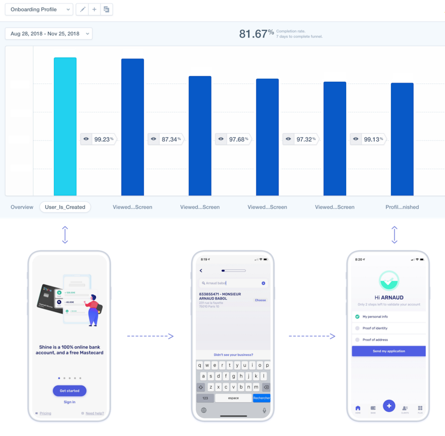
Onboarding funnel 👋 Mixpanel
We are pleased with this result but it could be improved, we could actually autofill more information.
In fact just from the phone number and using an API like lusha or pipl, we could get our user’s information and their company information. This would make a single step onboarding flow, the less the user has to do, the best it is, for your user himself but also to increase your conversion rate.
In the end, the user onboarding is only the first step of our application onboarding, the next step would have to make the user fully active, then to make him stay, to make him generate revenue and finally to make him an ambassador. This will complete the full AARRR circle (Acquisition → Activation → Retention → Revenue → Referral).
Thanks
Shalla-Marie Lusambo Manga 🙏 for helping with my rusty English!

